GMC Teachers as Fonts
April 20, 2023
GMC Teachers as Fonts
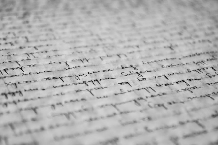
Do you ever think about what font type to use while writing something? Do you have a signature font that you use? Can people connect a font to your face? Well, here are some fonts that fit GMC teachers, whether it be their personality or actual handwriting.
![]()
Math teachers generally have sharp, legible handwriting because they consistently work with numbers (in my household, we call it “engineering handwriting”). Mr. Frans having the Courier New font just fits.
![]() (Mr. Fitzgerald)
(Mr. Fitzgerald)
Most history teachers I’ve had have scribbles for handwriting, and Mr. Fitz fits with the Redacted font.
![]()
Unlike Mr. LaPoe, Mr. Gallion has somewhat legible handwriting. The Combo font is similar to his normal handwriting, so I saw it fit.
![]()
Mr. Cook is sharp and formal, and for being an English teacher, he almost always uses Times New Roman. His being Times New Roman just fits.
![]()
In Senior Project, Ms. Earle always uses Cambria for every assignment. I can’t imagine her as any other font.
![]()
Libre Baskerville is a fancier font similar to Times New Roman. Mr. Lowman is quite fancy and respectable, which makes Libre Baskerville a good fit.
![]()
As an art teacher, Ms. Perez has a mix of fancy and messy handwriting. The Inspiration font fits perfectly with Ms. Perez’s style.
![]()
Ms. Rouse has some of the best handwriting of all of the teachers at GMC. The Dr. Sugiyama font looks similar to her handwriting and is a good match for her.
![]()
Ms. Sawicki also has one of the cleanest handwriting, but her signature is notably one of the prettiest I’ve seen. While there isn’t a perfect replica of her signature, the Lavishly Yours font is really close.

